Media Campaign
This was an assignment where I had to set up my own media campaign, using a poster. On this page I will give a short explanation on how I made it.
The Assignment
Right around the end of the first course, our class was tasked with setting up our own (fictitious) media campaign with a clear call-to-action. I decided to use doomscrolling as my subject, as this is an issue that I'm also affected by.
Doomscrolling is a phenomenon that is widely spread across social media. Instagram reels for example, you watch a short video, you scroll and you get another one. This causes a surge of dopamine, which is a hormone that makes you feel good. Because of this, you become hooked on mindlessly consuming content and spend hours doing it, without even noticing. The algorithms that provide the content are designed to keep you hooked on the app for as long as possible.
When you are doomscrolling, you receive a very large amount of dopamine, which is the feel-good hormone produced by our brains. This is why these apps are so addicting. There is a very big downside to this: doomscrolling causes you to consume mountains upon mountains of short content, which severely decreases your attention span. It can become so severe that you can't get anything done that you have to do, because it doesn't feel rewarding anymore. This is because your dopamine intake has been completely thrown off balance.
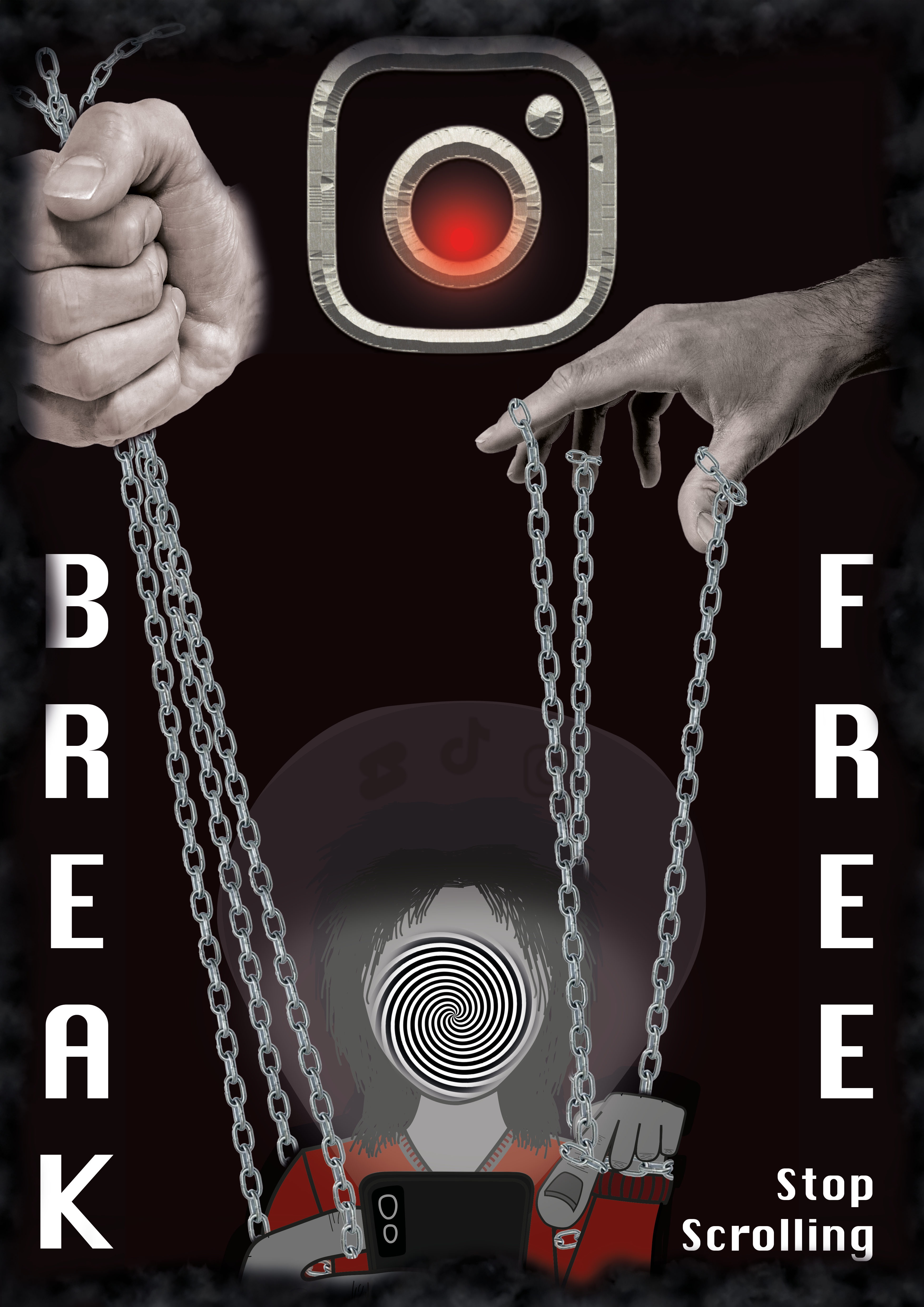
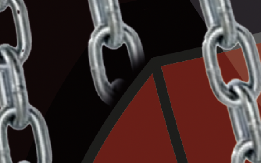
That's why I decided to take a stance against this practice through the use of this media campaign. In the poster I depicted Instagram as an ominous entity controlling the user through the use of chains, and forcing them to keep scrolling.
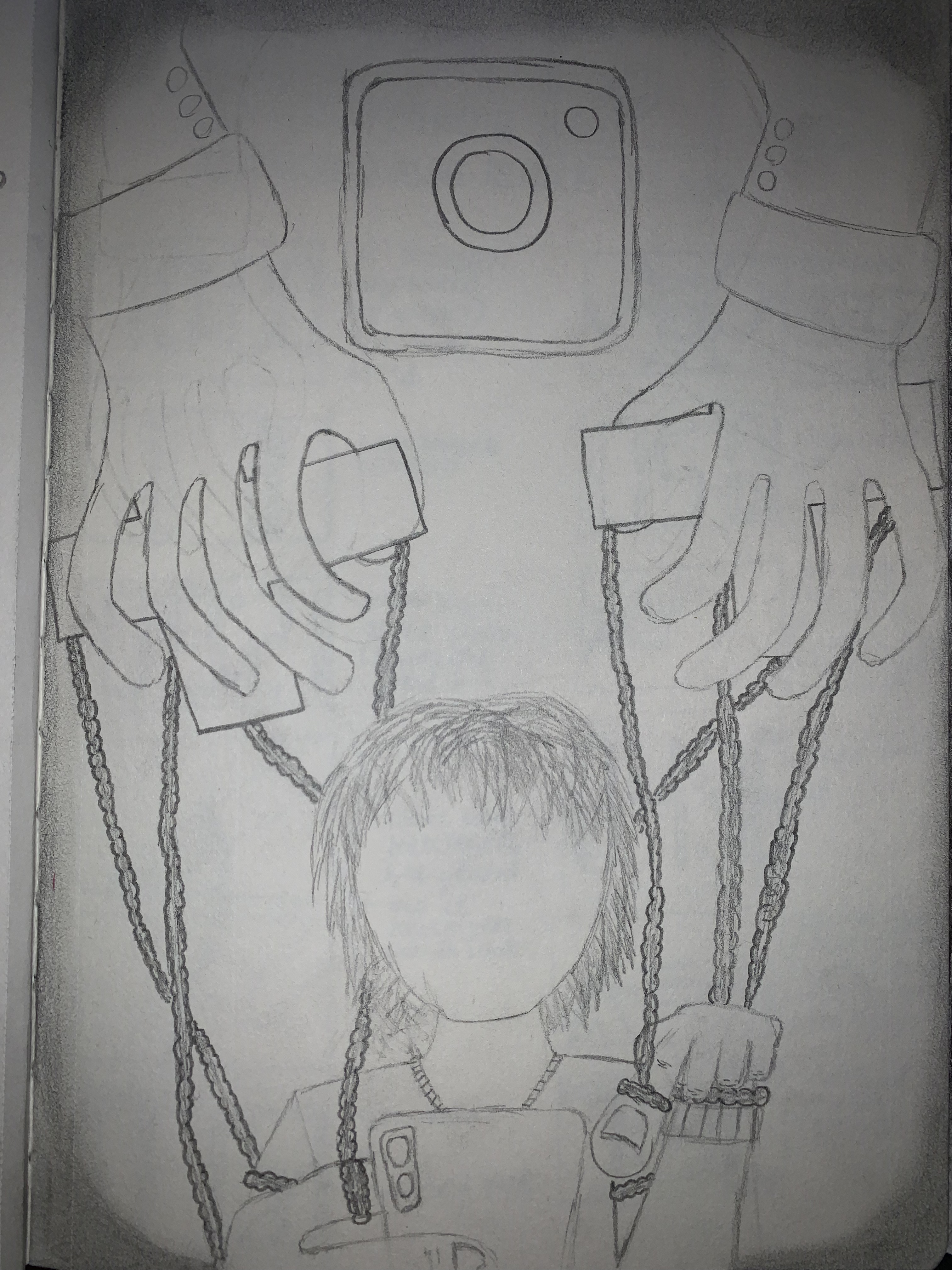
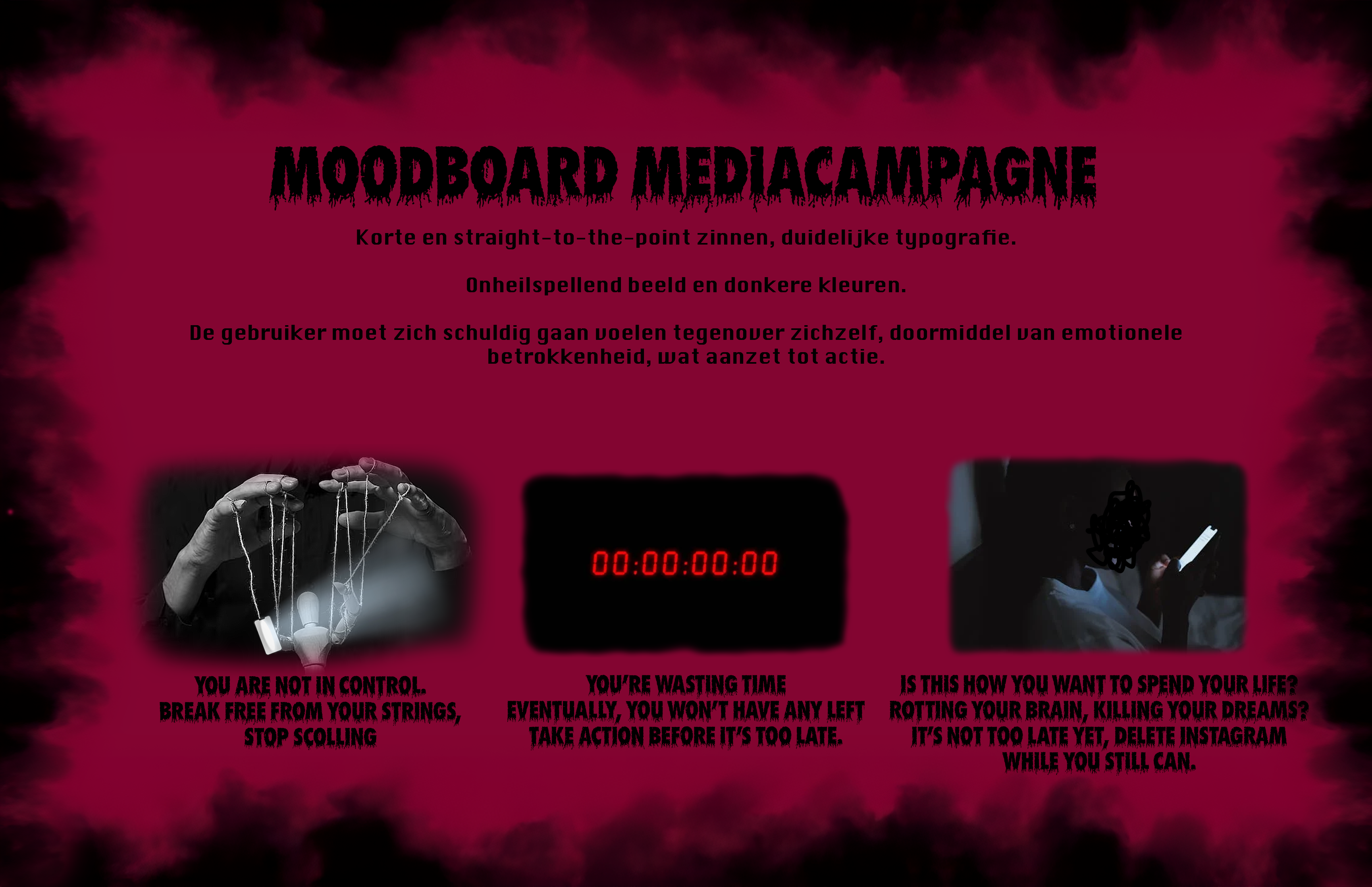
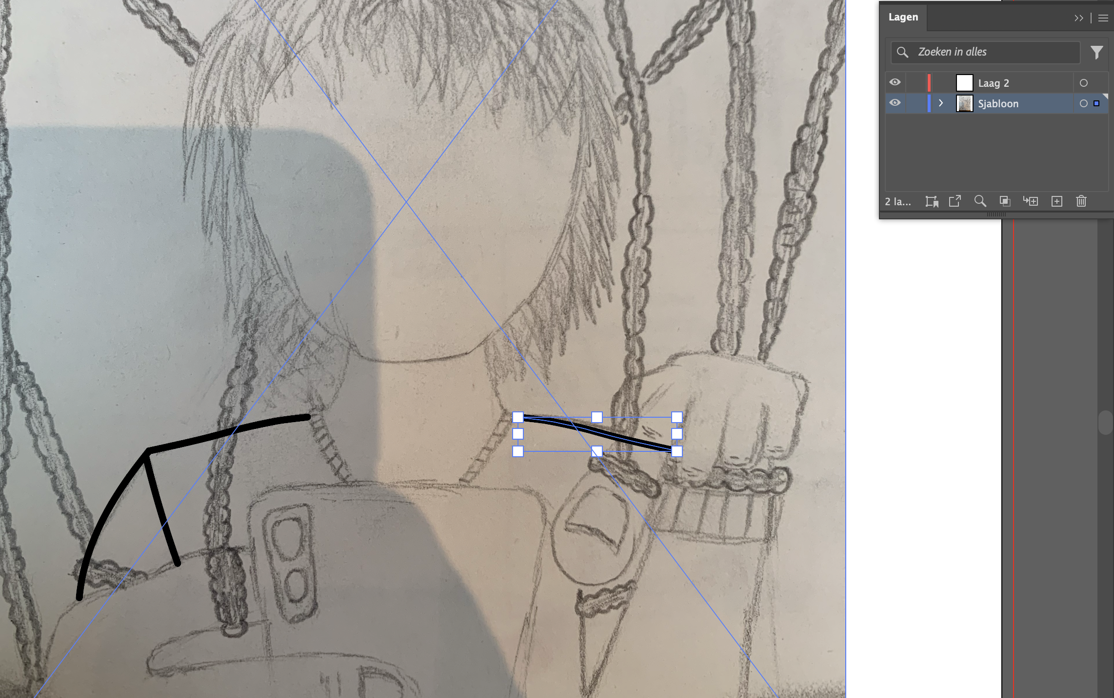
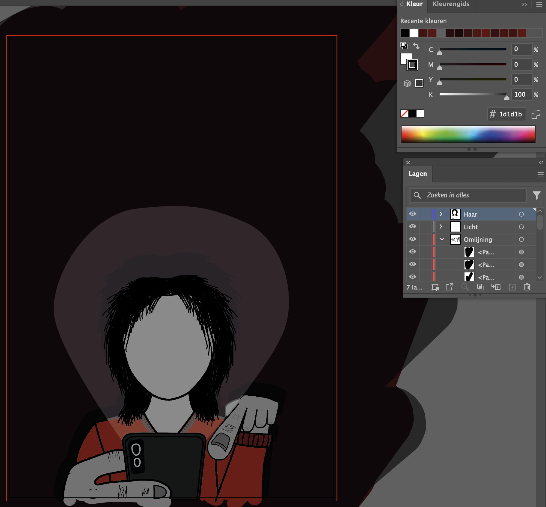
For creating the poster, I decided to test my newly learned skills in Adobe Illustrator and Photoshop. I started by making a bunch of sketches and a moodboard. After that I made a follow-up sketch, which I used as a template in Illustrator. I drew over it, gave it colour and then moved it to Photoshop for the next step. I used Photoshop to add the rest of the elements, such as the hands and chains into my poster. (see pictures down below).
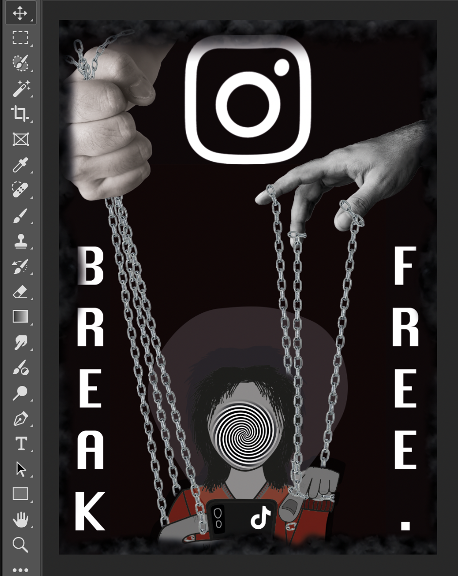
I was happy with how it turned out, especially given the fact that it was my first major design project and I was new to designing software such as Adobe. The poster has a clear call to action, which a viewer will be able to understand at first glance: Break free, stop scrolling.